
色とセンス
Color and Sense.
Photo by Pawel Czerwinski on Unsplash
自分の展示会の告知や季節の挨拶の用途でDMをつくれるように、とイラストレーターやフォトショップの勉強を始めた結果、知り合いの作家のものも手掛けるようになった。
自由にやらせて貰えるので、色々と勉強の成果を試させてもらったりして楽しみながら作らせてもらっている。
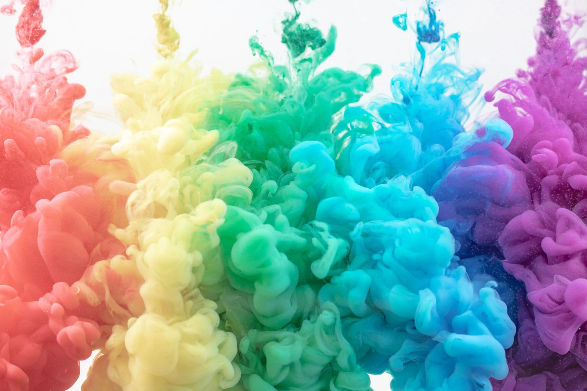
のはいいが、いつも配色で悩む。
色の組み合わせによる雰囲気はわかるが、この背景にどんな色を持ってきたらより引き立つのかというのは悩ましい。
(掲載する作品の雰囲気にもよるし)
色のレイアウトに関する資料を見つつ、家族に「どの色を持ってきたらいいと思う?」と聞くのである。
I started studying illustrator and Photoshop so that I could make direct mails to announce my exhibitions and greet the season, and as a result, I have started to make DMs for artists I know.
Since I am allowed to do so freely, I enjoy creating them while trying out the results of my studies.
It is good, but I always have a hard time with color schemes.
I understand the atmosphere created by the combination of colors, but I have a hard time deciding what colors to use for the background to make it stand out more.
(It also depends on the atmosphere of the work to be published.)
I look at the materials on color layouts and ask my family, “What colors do you think I should bring?” (It also depends on the atmosphere of the artwork.
◆ 展示会への出店はINFORMATIONをご覧ください。
◆ 作品をネットショップ「奏の軌跡」に掲載しております。
◆ オーダーのご依頼はこちらをご覧ください。
◆ 体験会・試着販売会はこちらをご覧ください
最新情報をニュースレターでお知らせします。
◆ ニュースレターのご購読はこちら
製作中の様子をinstagramで公開しています。
◆ 37JEWELRYのinstagramはこちら
これまでに発表した作品をYouTubeで公開しています。
◆ 37JEWELRYのYouTube Channelはこちら